Recreating A Graph With D3js
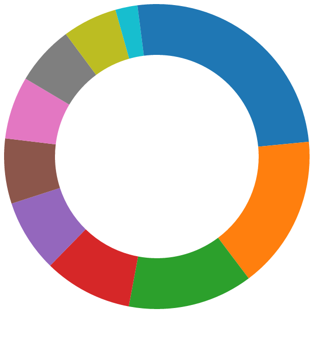
I joined Treehouse years ago with hopes I could supplement my college education with some web development. It wasn’t long until I was taking on tasks at work relating to the website and soon considering myself a real developer. One thing I always loved about the site was the design and colors. View it in real life along with my Treehouse profile. 
The data visualization is interesting here. Made with Highcharts, the color coordination and legend make it fairly easy to read how much you’ve learned at a glance. This works better than a bar graph because it is dynamic to 100% of everything you’ve learned and changes in proportion to how much of each category you’ve studied. The only confusing thing here are the points system which seem arbitrary at first.
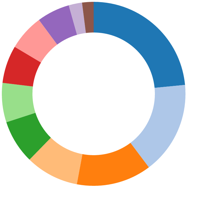
Something like this can be easily done with D3. First, get the skeleton of your site ready, import D3 and create a single divthis will be the only markup for the entire visualization.
Script Tag
All the magic occurs in the script. First we create our data with a simple array. Defending the colors early is important as well. The initial r variable is the radius that defines the whole svg. The canvas and group vars are also for sizing and placement on the webpage. innerRadius and outerRadius being different are what give our graph the pie shape with the hole.
Choosing Colors
Be careful when coloring your visualization. D3 has some functions that will color your graph with 10, 20, 30 and more color combinations. This can be tricky once you have more than ten slices of your pie, though. One set after the other might have an identical color with a different opacity; this might lead a viewer to believe the two values are related when really they could have nothing to do with each other. This happens once you use d3.scale.category20(). Instead, you could choose all your own colors with d3.scale.ordinal() .range([‘red’, ‘blue’, #E55D63]); and however many you’d like.
category10()
category20()
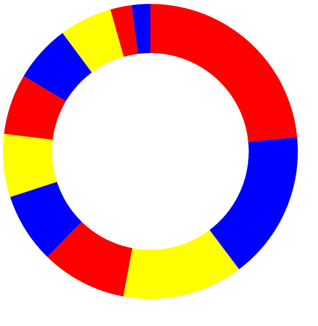
ordinal() .range(['red', 'blue', 'yellow']);
Conclusion
There is a lot more you can do with D3. I’ll follow this up with another post on how to make it more interactive. I’d like a tooltip to appear on hover and have the legend interact with hovering as well. It can be seen live here. Thanks for your time